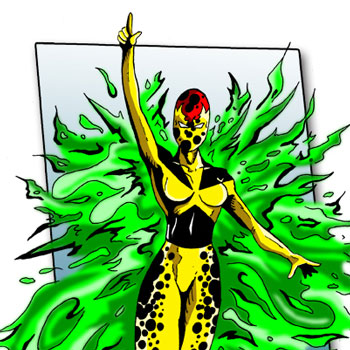
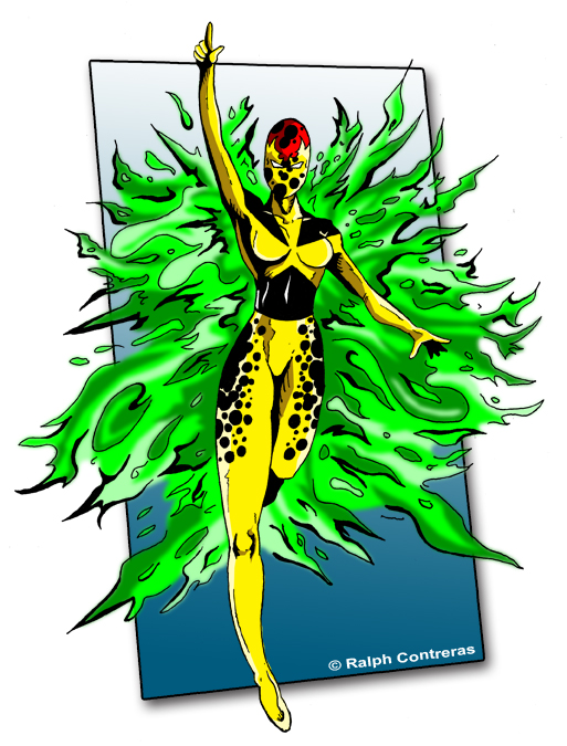
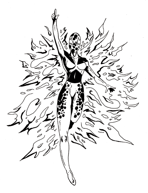
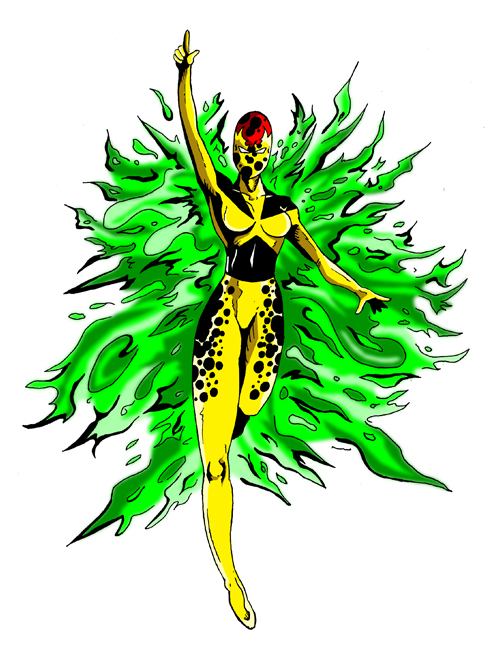
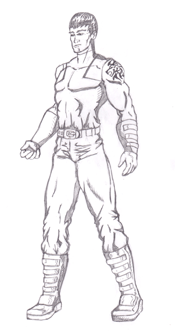
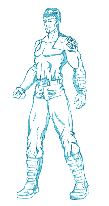
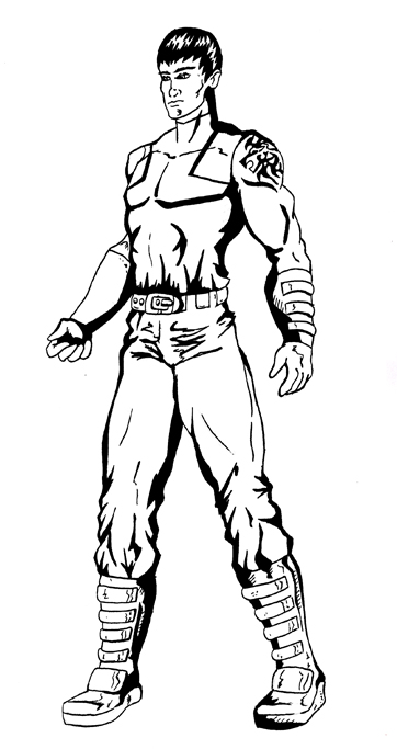
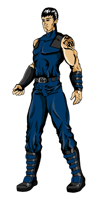
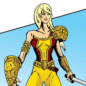
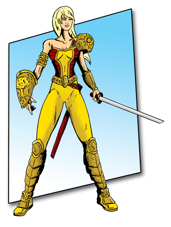
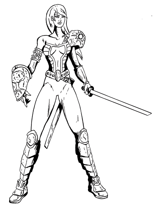
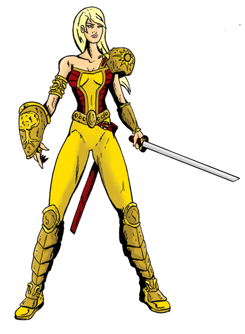
Atomic Blast – Character Design for The REPLICANTS Project
The idea of Atomic Blast came from a challenge to create a superhero team based on an existing superhero team. The REPLICANTS Project was created by Dean Rivet. Atomic Blast was inspired by Sunfire of the X-Men.
Susan Rosen’s grandfather Jason Rosen worked on Trinity, the first atomic bomb nuclear weapons test in New Mexico. While working on the test site, Jason was exposed to high radiation levels. Due to a genetic anomaly, he was able to absorb the deadly energies. He found he could control this energy in the form of a green flame. He became a crime fighter known as the Green Flame.
As a child, Susan began to manifest the same power as her grandfather. She keeps it a secret not knowing she inherited the power from him. Susan’s parents died in a car accident when she was 17, leaving Jason as her only living relative. With no one else to take care of Susan, she moved in with him. She discovered he had the same powers as she did. Jason trained Susan in the control of her powers. She decided to follow in his footsteps and become a crime fighter. With his help, she has taken the name Atomic Blast and uses her powers to fight evil.
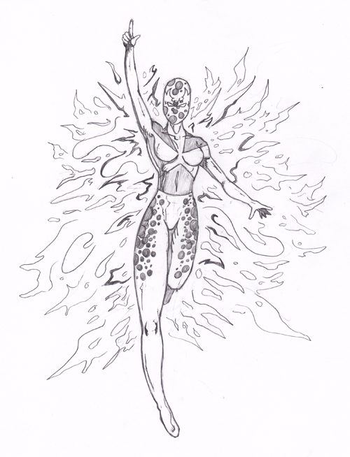
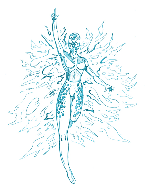
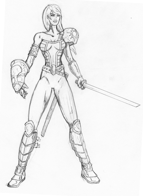
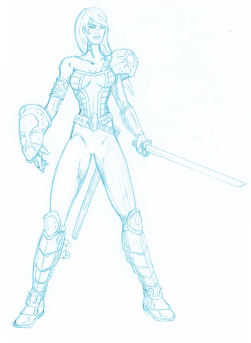
Here are the different steps I took when creating this character design. First I did my pencil drawing, I use a .5 HB Mechanical pencil. I then scanned and turned the pencils into blue lines. I went ahead and printed the blue lines and inked them. I used a nib pen 102. I then colored it in photoshop. I had fun with this illustration. I tried a few different techniques in the inking and coloring. I am very pleased with the results!
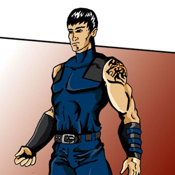
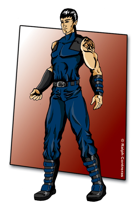
Lionsoul – Character Design for The REPLICANTS Project
The Character Design idea of Lionsoul came from a challenge to create a superhero team based on an existing team. The REPLICANTS Project was created by Dean Rivet. Lionsoul is inspired by Thunderbird of the X-Men. Mikhail Selimovict aka Lionsoul is a survivor of the Bosnian Genocide during the 1990s. During the Srebrenica massacre, Mikhail’s family was separated. Mikhail with his father and younger brother Jacob were taken to be executed. It was at this moment that his powers manifested. He found that he had accelerated senses, speed, and strength. He was able to save himself and his brother by fighting off the Bosnian Serb forces. Although they were able to survive, Mikhail and Jacob were now alone in the world. They have spent their time looking for their mother and sisters. Mikhail has taken the name Lionsoul and helps people when they are in need with his powers.
Here are the different steps I used when drawing the character design for Lionsoul. I first did the pencils. I didn’t want his look to be too superhero. He’s more of a guy who fights when he needs to, he doesn’t want to stand out in a crowd. Next, I scanned my pencils and tuned them into blue lines in photoshop. I then printed them out and inked them. I do this so I can keep my original pencils. I then color those inks in photoshop. I’m pleased with his look. I had fun designing his lion tattoo too.
Aurora Light – Character Design for The REPLICANTS Project
The idea of Aurora Light came from a challenge to create a superhero team based on an existing team. The REPLICANTS Project was created by Dean Rivet. The inspiration for Aurora Light came from Wonder Woman. What I did was look at what makes Wonder Woman a cool character. She has a rich history centered around Greek mythology. She’s an amazon warrior for peace. She’s also in this world, but not of this world. I took these core elements in the creation of Aurora Light and Sylvia Knightley. She is from another world, a world of monsters and angels. but she is on earth as a protector of humanity. Instead of looking at mythology, I centered her world around folklore. She is Lilith’s daughter, also known as Adam’s first wife. Like an amazon, Sylvia comes from a world of warrior women. She chooses to protect humanity from the dark evils that wish to harm it.
Art Process: Here are the different steps I took to create my character design illustration of Aurora Light. First I penciled out the original drawing. I used a .05 HB mechanical pencil. Then I scanned the pencils and turned them into blue lines in photoshop. I printed the blue line version on card stock paper. I used a nib pen and a Kohinoor Rapidograph Technical Pen .50mm to ink it. I did most of the inking with the nib pen though. Once I finished the inking I then scanned it again and sharpened the contrast in Adobe Photoshop. Then I created flats in photoshop and used them to help in digitally coloring the illustration. It was a fun challenge.
Character Biography: Before Aurora Light became the heroine of humanity she was taught to despise the children of Eve. Aurora Light’s given name is Sylvia, the warrior daughter of Lilith. Sylvia’s mother Lilith was Adam’s first wife before Eve. Lilith declared that she was Adam’s equal and would not be his subordinate. She flew away from the garden of Eden to find her own destiny in the world. But God sent three angels Senoy, Sansenoy, and Semangelof to take her back. When she refused they declared that she must permit one hundred of her children to die every day. Lilith’s sons were creatures of darkness and her daughters were born of perfect beauty. Lilith allowed her sons to die and raised her daughters as cunning warriors. Teaching them that the world was rightfully theirs and not the children of Eves’
Through the many centuries, Lilith slowly created an army of her daughters that she planned to take back the world. The strongest of these daughters was Sylvia. Sylvia was a natural warrior. Besting her sisters in training battles and tactical exercises. She was her mother’s most devoted follower, believing that mankind needed to be eliminated. These feelings changed though when she encountered Sansenoy, one of the angels initially charged with taking her mother back to Eden. On one of Sylvia’s daily running exercises, she discovers Sansenoy, and she is taken aback by his angelic beauty. Sansenoy and Sylvia began a secret romantic relationship. Meeting every day during her runs. Sansenoy had a true love for humanity and shows Sylvia the great potential and wonders that mankind could achieve. She slowly sees that humanity is not the great evil her mother has taught her. She starts seeing them as brothers and sisters. She keeps her new insights private for fear of her mother’s wraith.
Her relationship is interrupted when Sansenoy has to leave to prepare for a great battle. She soon learns that the great battle is with her mother and sisters. Lilith was mounting an attack on humanity. Sylvia is given the lead of the army, but she is torn between her loyalty to family and her new love for humanity. On the day of the battle, thousands of her brothers and sisters fight as many angels. Both sides take heavy losses, but Lilith’s army begins to take ground and the battle looks to be swaying in her favor. It’s at this moment Sylvia sees Sansenoy battling her sister Rachael. Rachael overpowers Sansenoy and Sylvia sees him take his last breath. Sylvia decides at that moment she cannot allow her lover to die in vain. She turns on her sisters and fights with the angels to stop her mother’s dark army. The surprise is enough to turn the tide and give the angel’s army the battle.
Sylvia leaves to earth and swearers to protect humanity from all evils, especially her mother. She moves to San Diego as Sylvia Knightley and takes the name Aurora Light when she fights evil. She choose the name Aurora Light in remembrance of the northern lights, where she and Sansenoy would spend time together.
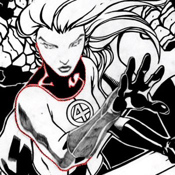
Digital Inking with Illustrator Vector Anchor Points
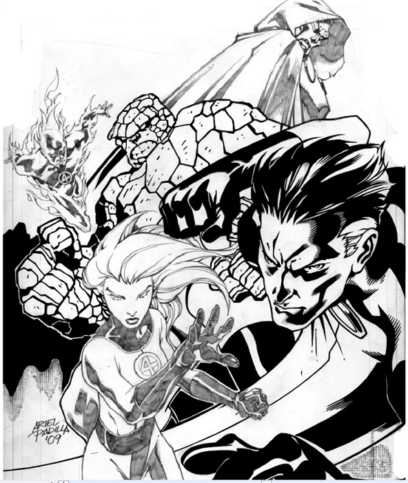
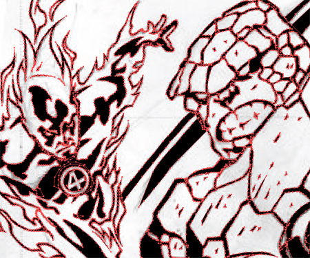
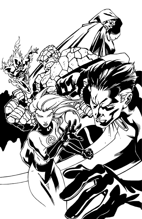
I’ve received several requests to show the steps I used to create my digital inking of the Fantastic Four pin-up I did of artist Ariel Padilla’s pencils. I was looking for some art to ink and found the pencils on his DeviantArt page. This was a practice exercise I gave myself in the inking process of comic book art using Adobe Illustrator. I’ve been a graphic designer for over 9 years but this was the first time I used my design knowledge for comic book inking.
For this self-assignment, I decided to use Adobe Illustrator for inking the pin-up. I had used photoshop for a previous piece earlier I did of Batman 2.0, a character redesign. I had fun with that illustration but this time I wanted to do this digital inking in vector format. Why choose vector verse bitmap? Well, a vector image is made up of anchor points that are connected by paths (lines) that connect them. A vector image can be re-sized without loss of quality to the illustration. So basically you can re-size the image as small or as large as you’d like without pixelation, it will keep its sharpness no matter the size. Which is really neat.
Points & Paths: Example 2
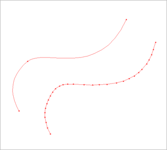
For this illustration, I choose to use my anchor points to create only straight paths (lines). I didn’t use any curved lines. The cool thing about using anchor points and paths is that you can make curved paths, resulting in fewer points This is shown in Points & Paths: Example 2. So why didn’t I use curve paths? Well, honestly it was a self-exercise to see if I could do it. I wanted to create curved lines through straight lines. I found it to be a fun challenge.
I did not create lines or outlines of the original pencils. What I did was look at each line as a shape. I could have easily used the brush tool in Illustrator, but I found I actually had more control over what I wanted to achieve by using the pen tool.
Points & Paths: Example 3
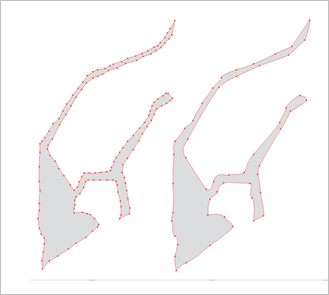
With the technique, I like to use anchor points and paths I am able to get a type of jagged smooth shape. The strength of anchor points is you can use as many or as few points as you’d like to create your lines or shapes. I’ve illustrated this in Points & Paths: Example 3.
Points & Paths: Example 4
After I created the shape from the pencils, I colored it in black. I’ve shown this in Points & Paths: Example 4. As you can see it’s a piece of a puzzle that makes up the inking. These shapes help to create the feel I was looking for when digitally inking this drawing. This technique really works well when inking the Thing’s rocky skin.
Points & Paths: Example 5
I have included more examples of the anchor points and paths technique I use in inking these pencils. In Points & Paths: Example 5, we see how the wavy fire on Human Torch can be created without using curved lines. Every anchor point in the flames helps to create the illusion of line weight, depth, and movement.
Points & Paths: Example 6
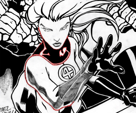
In Points & Paths: Example 6, I’ve shown how I created what looks to be a line on the Invisible Woman’s arm. It is actually a curved shape created with paths. It is a shape that includes the bottom line of her arm and the shadows around her neck. You can see her hands and the background is already colored in.
Although this technique might not seem to be the most efficient, it allows for a lot of control. Looking at each line as a shape helped me to create a type of line work I would not have achieved otherwise.
This was my first comic book digital inking using Adobe Illustrator with the anchor points and paths technique. I have done a few more since this one. Although I have used curved lines in those illustrations. This was a fun self-exercise in learning to digitally ink the work of someone else. I am very happy with the way this illustration came out, and I’ll continue to use Adobe Illustrator to digitally ink comic book pencils.
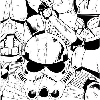
Vader’s Fist – The 501st Legion – Digitally Inked in Adobe Illustrator
A few months ago I decided to draw Vader’s Fist, the 501st Legion. I’m a huge Star Wars fan and wanted to draw something cool. I usually draw comic book characters but I think it was a fun change to draw some sci-fi stuff. The 501st Legion is cool because they are in the prequels, the original trilogy, and the extended universe. They are the highest and most elite Stormtroopers in the Empire. First starting off as the best clone troopers then as Darth Vader’s personal squad. Check out this article at Wookipedia to learn more about them.
This is the final digital inking of my original 11″x17″ drawing. I used my graphic design skills in adobe illustrator to ink the 501. The original drawing was done with an HB woodless pencil. I posted it in an earlier blog post, Vader’s Fist – The 501st Legion – Pencil Drawing. Check it out if you’d like. What’s really cool is if you do a Google image search for “Vader’s Fist” the original pencils show up on page one.
501st from Star Wars: Episode III – Revenge of the Sith
For this digital inking, I decided to use Adobe Illustrator. I’ve done inking in Adobe Photoshop before, but I find that I really like the way my digital inks look in illustrator. In illustrator your inking is in vector, this allows you to enlarge the image with no pixelation. So if I really wanted to I could make a print the size of a building and it would look awesome and sharp.
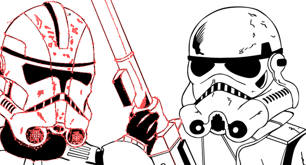
Example of anchor points
The tool I like to use in illustrator is the pen tool. I do have a Wacom table, but I feel I have more control with the mouse and pen tool. It lets me create a smooth/jagged line in my piece. I work with anchor points to create curved lines, straight lines, and solid shapes. There was some line work where I did use the brush tool with my Wacom tablet, but most of this digital inking was done with the pen tool.
I’ve very happy with the way this digital inking came out. Ever since I moved to Santa Fe last year, I’ve felt a real recharge in my artwork. The penciling and inking of Vader’s Fist, the 501st Legion is a great example of this. I had a real blast inking it. Shazam!
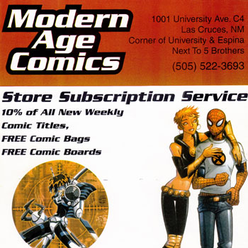
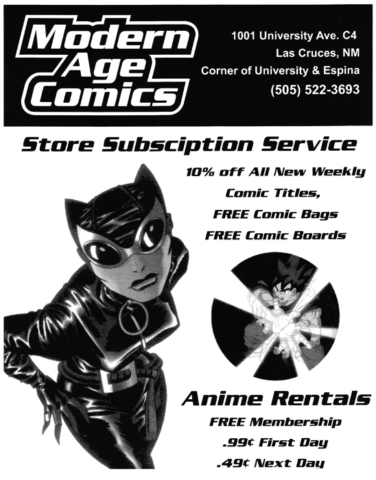
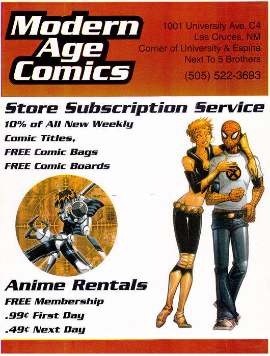
A few days ago my girlfriend was cleaning one of my old portfolio cases. I told her she could use it for a collections class she is taking this semester. As she was taking out my old work that was still in the portfolio case she noticed there were some ads I created for my old comic book shop “Modern Age Comics”. I had created them a few years back and I had totally forgotten that they were in there. They were actually pretty good and I’m kinda proud of them. So I’ve decided to post them in this blog as a walk down memory lane and to showcase some of my old comic shop work.
This black and white flyer is actually the very first flyer I created for my store. I created it in Adobe Illustrator and Photoshop. The images are halftone dots. I have always been very fond of using halftone dots. I remember making hundreds of xerox copies of this flyer and plastering them all over town and the university which was across the street from the shop. I had a lot of fun with this flyer. I remember choosing the image of Catwoman for this flyer because she had a great pose and I choose Goku from Dragon Ball Z because he was in a very dynamic shot.
This second flyer is actually the back of a magazine named the “Green Frog”. This is from the very first issue of this NMSU student-created magazine. I was approached by the magazine’s editor-in-chief who was also the marketing director. I wanted to make this ad a little more youthful and found a great image of Marvel Girl and Spider-Man in more updated costumes. This was a full-color ad and I used a red header that complemented the red in Spider-Man’s costume. I liked the targeting image I choose with the anime character too. This was a fun ad to create.